

A Modernized Web Experience Embiggens Natural Gas Service

TL;DR
GNG had been a Macquarium client for nearly 10 years, and I'd personally led design on dozens of their projects. When their decade-old platform finally ran out of road, they trusted us to rebuild it.
In just 10 months, we delivered a full-stack overhaul — new platform, new design system, redesigned self-service tools, and personalization baked in throughout. New customer conversions jumped 24%. GNG had hoped for 6%.
Background

Georgia Natural Gas partnered with us to overhaul a decade-old website suffering from outdated visual design, inefficient workflows, and a tangled, aging codebase. Much of the site's content was hand-coded — a symptom of having no modern CMS or DXP foundation.
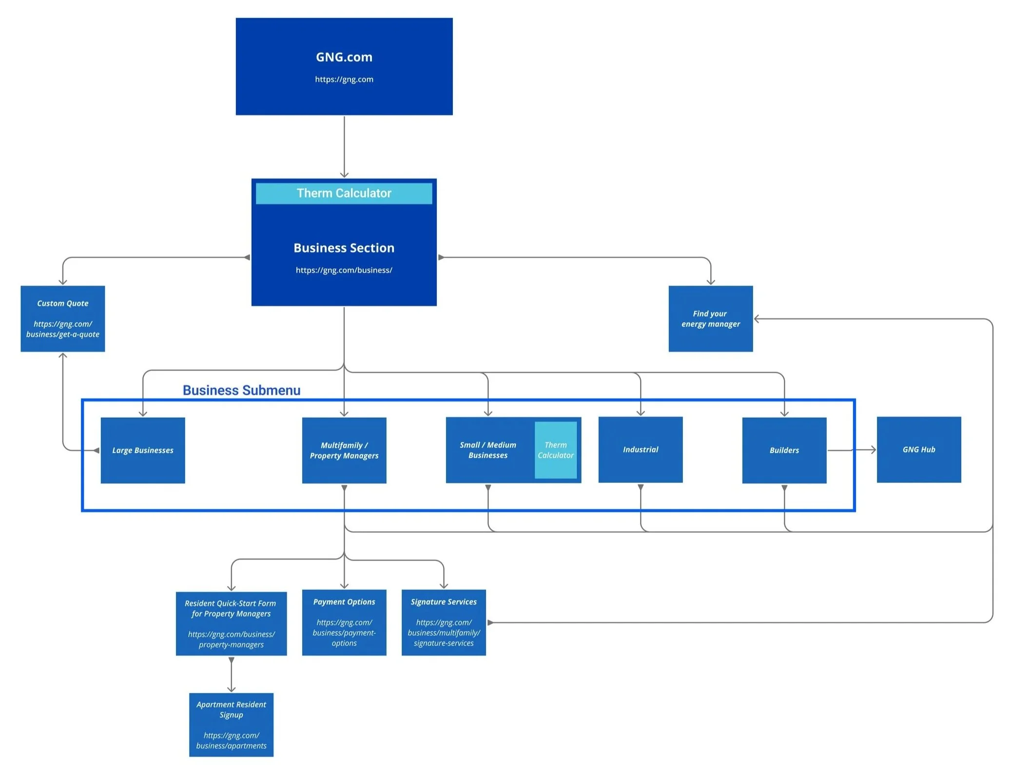
The experience also included multiple self-service tools, ranging from enrollment wizards to account preference dashboards, that were powerful in theory but undermined by legacy architecture and integration issues.
Our goal: replatform on Kentico, redesign from the ground up, integrate personalization via Moengage, and completely reimagine the gas shopping and service plan renewal experiences.
The Challenge
Deceptive Complexity
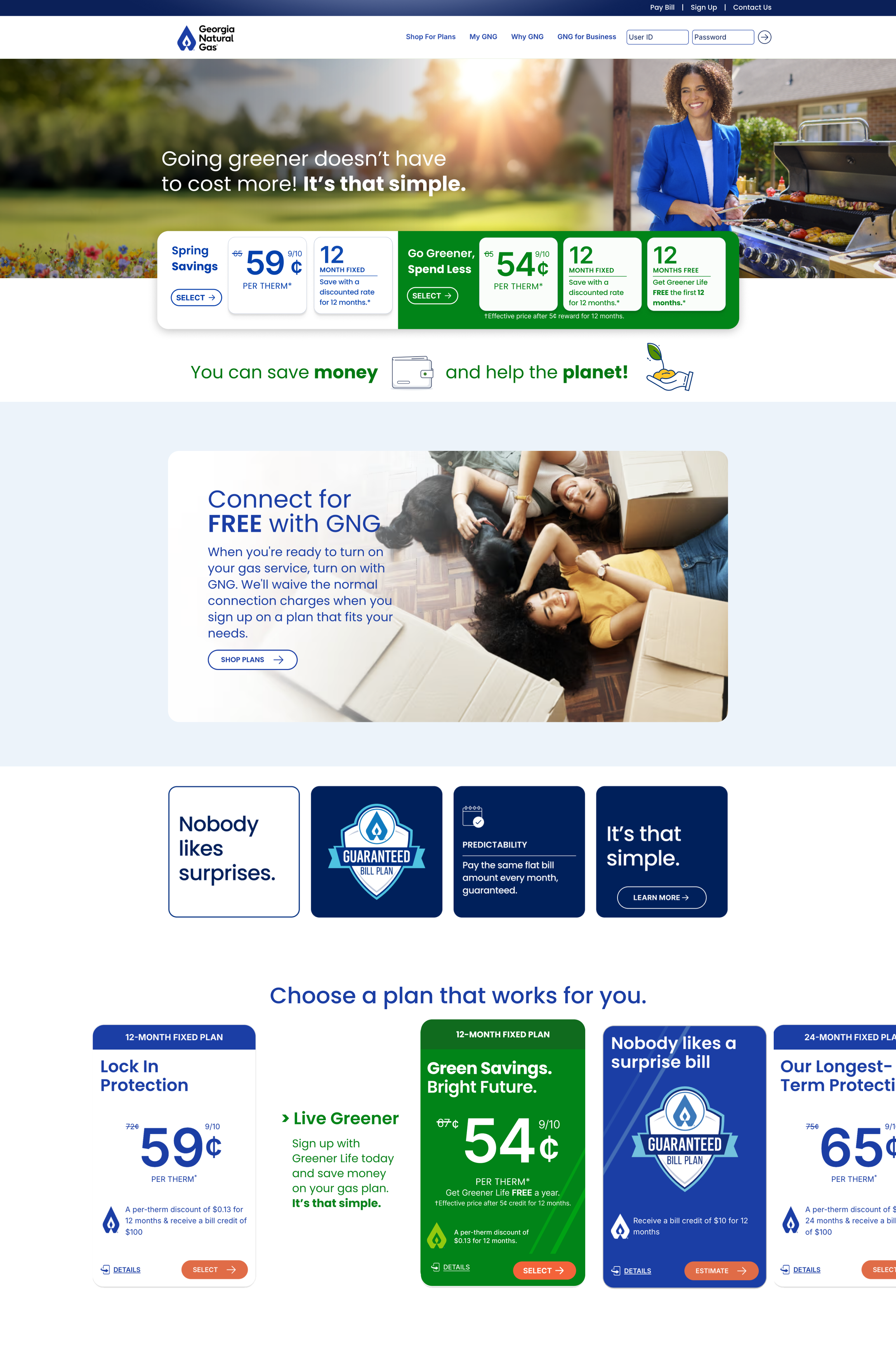
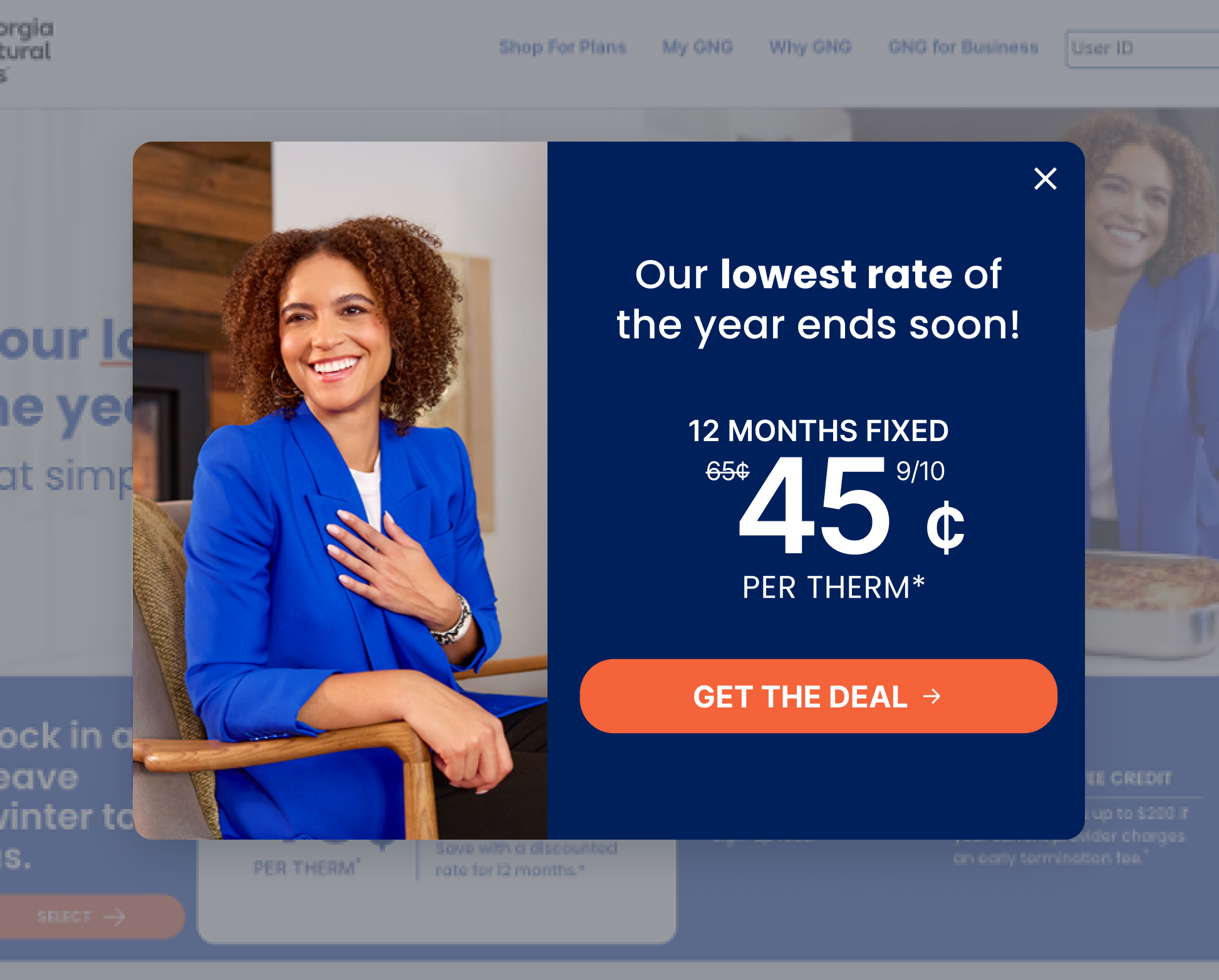
What seemed like a straightforward list of gas plans was actually a complex web of standard vs. custom pricing, promotions, customer data, and bundles.
Regulatory Compliance
Every aspect of the site — copy, imagery, product strategy, opt-in services, core logic, and flows — was governed by stringent industry regulations. Legal review was a constant presence throughout the project.
A Need for Focus
The existing site offered customers little direction. Content was scattered, self-service tools had fragmented flows, and the overall experience lacked a coherent through-line. Clarity would have to be designed in from the start.
A Need for Speed
A project of this scope would typically mean a phased, multi-year release plan. GNG wanted a full launch in time for their fall sales campaign. We had 10 months for discovery, design, and delivery. No exceptions.
My Role
Led the Macquarium design team — 4 UX Designers, 1 Visual Designer, and 1 Art Director
Owned the program plan, workstream plans, project estimate, SOW, and day-to-day timelines and milestones
Drove discovery and design direction across all workstreams
Oversaw our Business Analyst through requirements development
Consulted with strategy and analytics specialists on tracking and personalization strategies
Planned and facilitated workshops for discovery, co-creation, and design review
Directed the build-out of a new Figma design library with supporting Confluence documentation
Applied 7 years of GNG domain knowledge to guide contributors and pressure-test decisions in depth
Ensured design quality assurance and standards compliance across multiple parallel workstreams
Our Approach
1. Strategic Planning and Team Structure
We assigned the full design team to the project and split the solution into parallel workstreams, each designer owning a distinct segment of the site or a specific self-service tool. Information architecture and user flows would be tackled holistically, with designers partnering to ensure clean solutions to areas of overlap.
From the start, we worked closely with developers and strategy and analytics specialists to ensure the solution made full use of the new Kentico DXP, Moengage personalization engine, and Quantum Metric analytics platform — significant under-the-hood upgrades that would shape everything downstream.
2. Highly-Parallel Design
Ten months sounds reasonable until you map the full scope against it. With six designers running simultaneous workstreams, the challenge was keeping everyone productive without creating bottlenecks — particularly for the dev team, which needed a constant feed of completed, reviewed work. Each element moved through a rapid design cycle calibrated to its complexity and priority, with legal, analytics, and business stakeholders pulled in as each piece demanded. Coordination was as much the job as design itself.
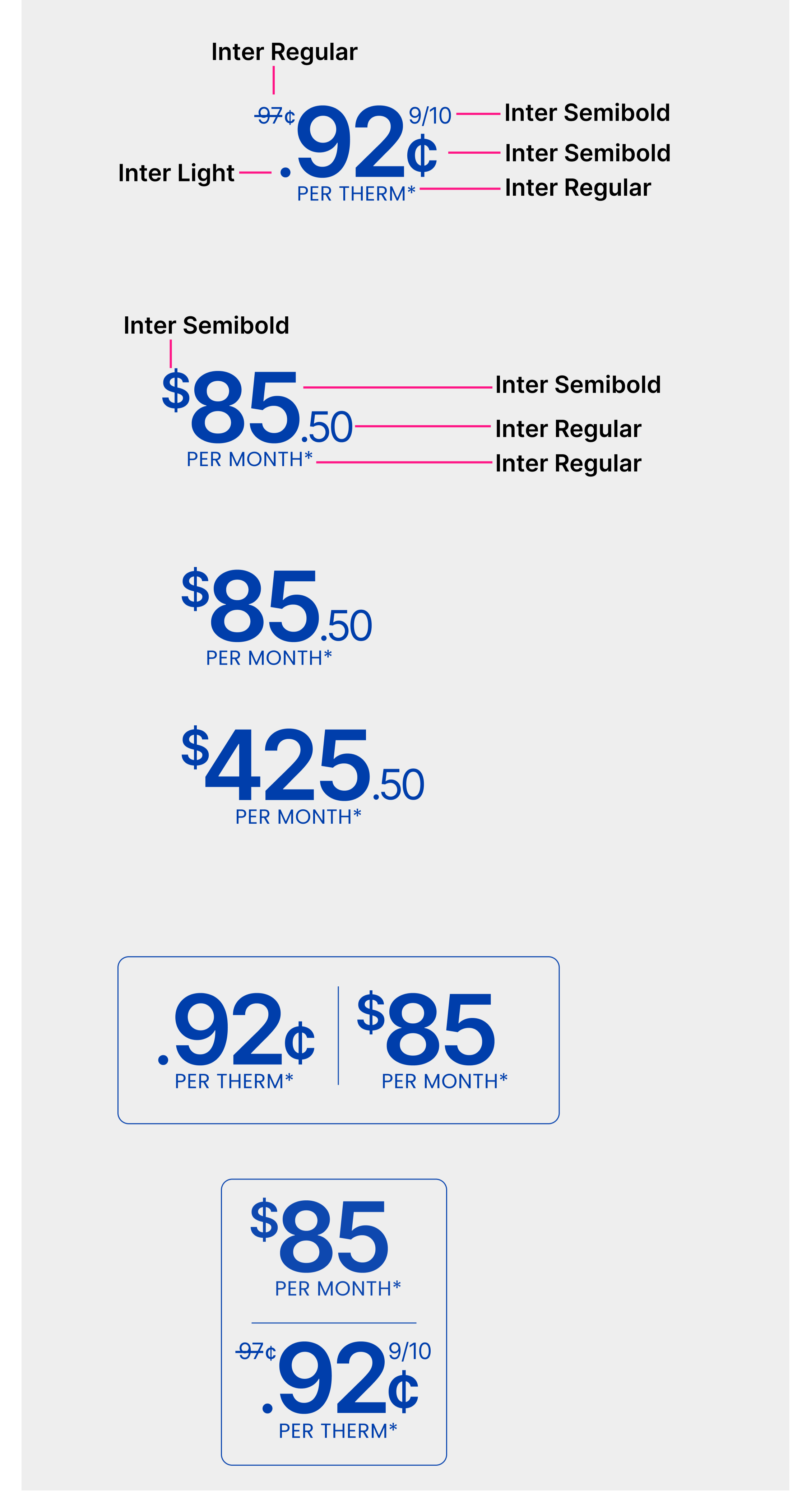
3. Progressive Design System Build-Out
GNG's rebrand meant there was no existing design system to inherit — we were building from scratch while simultaneously designing the product. We also didn’t have the luxury of up-front time to spend building a full design system. So we built a starter kit: the core styles and components we knew we'd need immediately. From there, the system expanded iteratively alongside the product, with central governance to keep it consistent across six designers working in parallel. By go-live it was comprehensive enough to support GNG's internal team for ongoing work well beyond our engagement.
4. Weekly Sprints
The project required a degree of "AgileFall" pragmatism — some workstreams suited agile cadences, others didn't. We worked as close to a weekly sprint rhythm as possible, managing the full program in JIRA with common naming conventions and versioning standards in Figma to keep six designers and multiple client teams aligned. Peer reviews happened daily; client office hours three times a week. Credit where it's due — GNG's stakeholders showed up week after week at a level of intensity that made the whole thing work.
5. In-Flight Accessibility Testing
Accessibility compliance is easy to bolt on at the end and expensive to fix when you do. We wanted WCAG 2.2 AA baked in from the start. Previous projects had relied on offline checklists and manual design QA passes at each milestone — effective but rework-heavy. For GNG we introduced Stark, an accessibility extension for Figma that provided automated feedback as assets were created. Automated testing is a complement to manual testing, not a replacement — but in a project moving this fast, it meaningfully reduced rework and kept compliance from becoming a last-minute scramble.
6. Critical Rethinking of Self-Service Tools
The easy move would have been a reskin across the board — scope, approvals, and timeline all pointed that way. But that wasn't good enough for us or for GNG. We triaged all 9 self-service tools and assigned each a treatment based on its criticality. Six were essential to customer acquisition and retention and would get the full redesign treatment. The remaining three were fundamentally sound and would be reskinned. Of the six, the four most complex would be fully reimagined — deeper integration, streamlined flows, and a significant emphasis on automation and guided experiences.
7. Designing for Personalization
One of our biggest enablers was Moengage — a behavioral tracking and personalization engine that builds predictive profiles of what individual users are looking for. It let us work around several outstanding legacy architecture limitations while delivering something genuinely better: prioritized content, tailored offers, contextually relevant self-service options, and targeted upsell opportunities. The trade-off was a big increase in visual design and copy assets to produce. Totally worth it.
8. Delivering at Scale
Personalization doesn't come free. Every tailored experience required its own visual design and copy assets — and with multiple customer segments across a large site, that added up fast. We built the asset production into the workstream plan from the start, treating it as a first-class deliverable rather than an afterthought. The result was a personalization layer that was genuinely comprehensive rather than cosmetic.
The Solution

Flexible, one-stop self-service
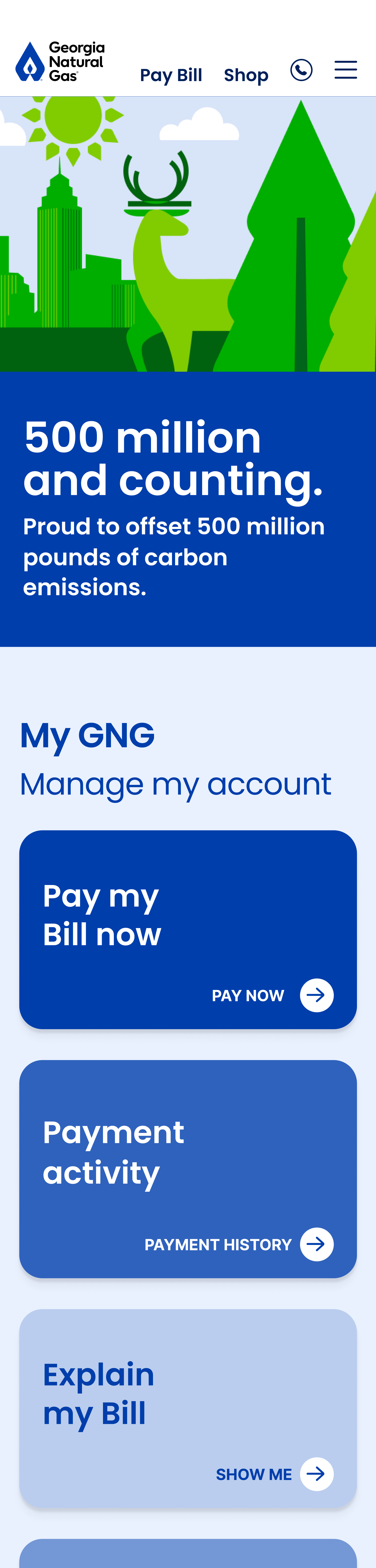
Mobile-first responsive layouts
Modular templates with full DXP/DAM integration
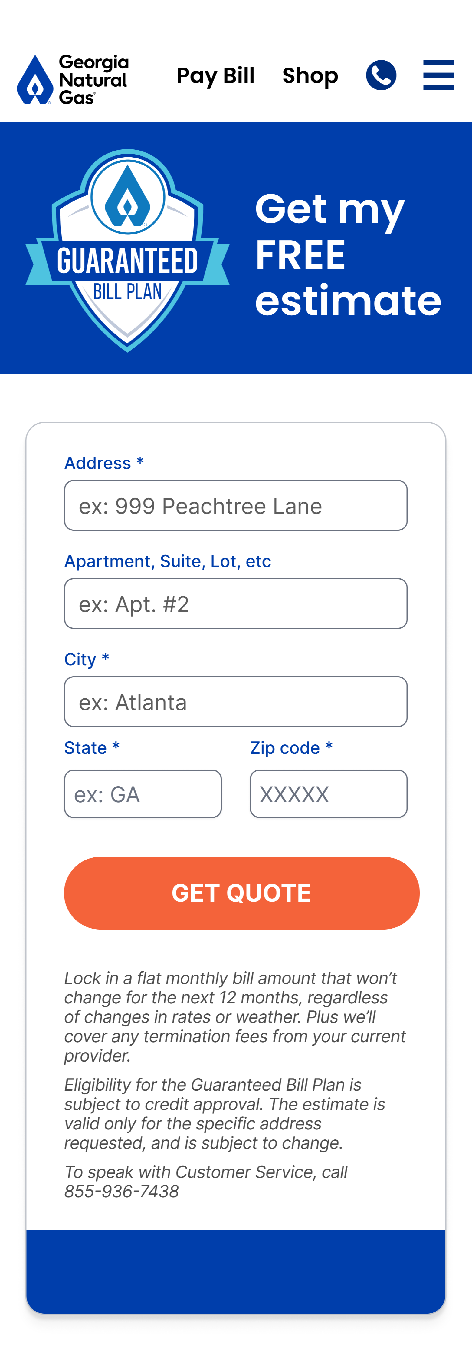
Real-time quotes calculated from individual gas usage
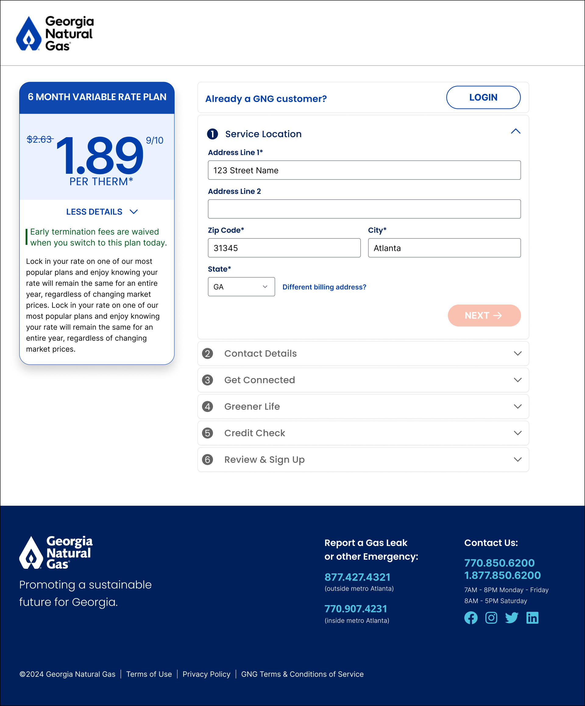
Intuitive, customer-aware enrollment
Plan & offer recommendations personalized to every visitor
The Results
24%
Increase in New Customer Enrollments
GNG wanted to see a roughly 6% uplift in customer acquisition. They were skeptical that an updated site could achieve much more. We quadrupled their expectations.
Faster,
More Affordable Support
We built the new site to be supportable. With a full design system, a DXP, top-end analytics & personalization tools, and deep documentation, for the first time GNG.com became easy to support and upgrade.
Modernized Self-Service, End to End
Nine tools updated, six fully redesigned, four completely reimagined. What had been a fragmented, friction-heavy self-service experience became cohesive, streamlined, and genuinely intuitive.